
Financial charts and graphs are essential tools for interpreting data, spotting trends, and communicating performance clearly. From investment reporting to internal financial analysis, these visual elements help simplify complex numbers and drive better business decisions.
In fact, studies show that data visualization in the financial sector significantly improves comprehension and supports more effective communication.
In this guide, we’ll explore the most common types of financial charts, when to use each, how to build them in Excel, and how to automate financial document creation at scale with a fund fact sheet software.
Table of Contents
- What Are Financial Charts and Graphs?
- Most Common Types of Financial Charts (With Examples)
- How to Choose the Right Financial Graph
- Creating Financial Graphs in Excel
- Financial Graphing Software: Tools and Solutions
- Automating Financial Graphs with Pagination
What Are Financial Charts and Graphs?
Financial charts are visual representations of financial data. They help finance professionals, analysts, and investors identify patterns, compare figures, and monitor changes over time.
Whether it’s illustrating quarterly revenue growth, forecasting expenses, or showing portfolio allocation, a well-designed financial graph can transform raw data into actionable insights. They are an essential components of fund fact sheets.
Why Financial Visualization Matters
In financial reporting, such as financial prospectus or fund fact sheet, clarity is everything. Charts and graphs are easier to interpret than tables, especially when dealing with large datasets. They support storytelling, highlight trends, and can influence strategic decisions in boardrooms and investment meetings alike.
Most Common Types of Financial Charts (With Examples)
Choosing the right type of chart depends on the message you want to convey. Let’s look at the most widely used financial graphs:
Line Graph
Best for: Tracking performance over time, such as time series financial data. They are useful for showing how a variable evolves during the time, such as revenues, cash flows, profit/loss.
Example: Stock price changes across a 12-month period
Line charts are ideal for visualizing trends, especially when dealing with time series data like revenue, NAV, or market indices.

Bar Chart / Column Graph
Best for: Comparing discrete values across categories such as departments, regions, or fiscal years.
Example: Revenue by product line or operating unit. Bar charts offer strong visual contrast to highlight differences.
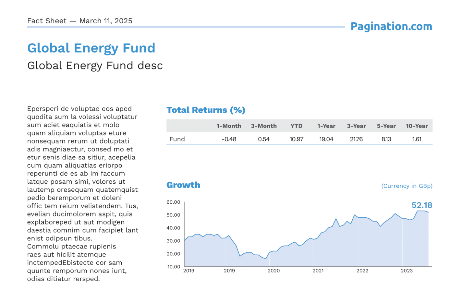
Pie Chart and Donut Chart
Best for: Illustrating percentage breakdowns of a whole where the number of categories is small and clearly distinguishable.
Example: Portfolio allocation by asset class. Best used sparingly, ideal for high-level summaries, not granular data.
Area Chart
Best for: Showing cumulative totals or changes over time while emphasizing volume or magnitude.
Example: Aggregated value of a portfolio over multiple years. Useful for highlighting overall growth and investment accumulation.

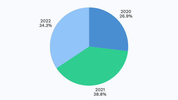
Stacked Bar Chart
Best for: Showing how subcategories contribute to a total, enabling detailed part-to-whole analysis.
Example: Operating expenses broken down by cost center. Great for comparing both totals and internal composition across items.
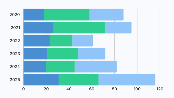
Scatter Plot and Bubble Chart
Best for: Exploring relationships between variables, identifying clusters, trends, and outliers in complex datasets.
Example: Return vs. volatility for a set of funds. Bubble charts add another layer by varying point size (e.g., AUM).
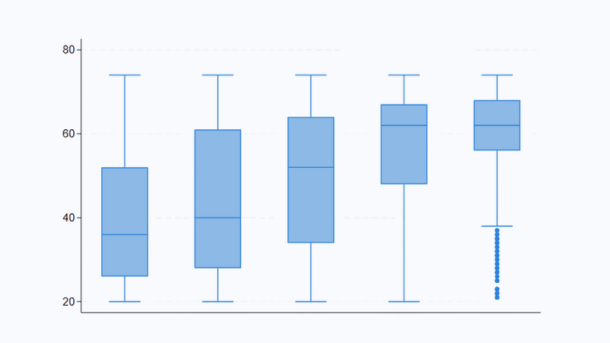
Box and Whisker Plot
Best for: Displaying data distribution, spread, and identifying statistical outliers, especially in performance analysis.
Example: Monthly return volatility over three years.Provides a full picture of data variability and median performance.
Waterfall Chart
Best for: Breaking down a total value into incremental positive and negative changes, making drivers of performance transparent.
Example: Profit evolution from gross revenue to net income. Perfect for showing sequential impacts in financial results.

Heat Map
Best for: Highlighting variations in intensity across two dimensions using color gradients, ideal for large data tables.
Example: Sector performance across global regions. Enables at-a-glance detection of strong and weak performers.
Multi-line Chart
Best for: Comparing trends across multiple categories or entities on the same timeline.
Example: Tracking performance of multiple funds versus a benchmark. Useful when analyzing relative movement over time.

Cumulative Performance Chart
Best for: Showcasing total compounded growth or return from inception to date, ideal for long-term investment tracking.
Example: Portfolio growth since fund launch. Common in institutional and retail fund reporting.

How to Choose the Right Financial Graph
Choosing the right financial chart is essential to communicate your message clearly and accurately. Here’s how to match each chart type to your data story:
- Comparing Categories: Bar and Column Charts: use when comparing values like revenue by region or departmental costs. Bar charts work well with long labels, column charts suit compact categories.
- Tracking Trends Over Time: Line and Area Charts: best for time-based metrics like stock prices or NAVs. Use line charts for clear trends, area charts to show cumulative growth.
- Part-to-Whole Relationships: Pie and Stacked Bar Charts: use pie charts for simple proportions, and stacked bars when comparing compositions across categories (e.g., expense breakdowns).
- Relationships and Correlations: Scatter and Bubble Charts: ideal for analyzing links between variables: scatter plots show distribution, bubble charts add a third dimension like fund size.
- Data Distribution: Box and Whisker Plots: use to visualize spread, medians, and outliers, especially for returns or volatility.
- Step-by-Step Changes: Waterfall Charts: perfect for explaining how values build up or decrease, like gross to net profit or cash flow components.
- Pattern Recognition: Heat Maps: highlight intensity or performance variations across large datasets using color.
- Comparing Multiple Series: Multi-line Charts: track several trends simultaneously, such as multiple funds vs. a benchmark.
- Long-Term Growth: Cumulative Performance Charts: best for showing compounding returns over time, ideal in fund marketing and investor reporting.
Creating Financial Graphs in Excel
Excel remains a go-to solution for quickly building financial charts, whether you’re visualizing historical data or illustrating financial projections. Here’s how to create a clear, professional-looking financial graph in a few simple steps:
Step 1: Organize Your Data
Prepare your dataset in a structured table.
- Use rows for time intervals (e.g., months, quarters)
- Use columns for financial metrics (e.g., revenue, profit, projections)
Make sure your data is clean, complete, and free from formatting inconsistencies.
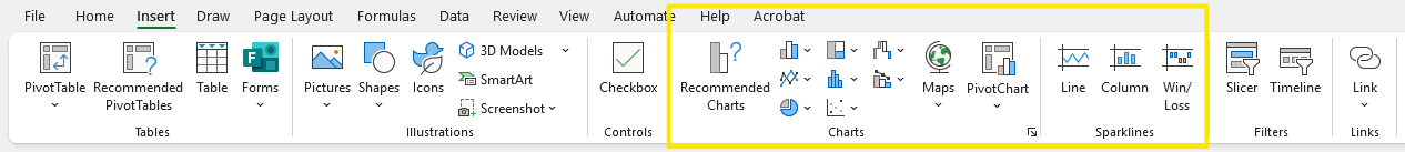
Step 2: Insert the Right Chart
Select the data range, then go to:
Insert > Chart > Choose chart type
- Use a line chart for trends over time
- Use an area chart for cumulative growth
- Use a bar or column chart for comparisons
Step 3: Format for Clarity
Customize your chart to enhance readability:
- Apply currency or percentage formatting
- Remove unnecessary 3D effects or background noise
- Use consistent colors and highlight key series
- Add a clear title, axis labels, and data markers
Step 4: Distinguish Actuals from Projections
To include projections:
- Extend your dataset with forecasted values
- Format future data with dashed lines, lighter colors, or annotations
This makes the difference between actual and forecast data visually clear.
Excel financial graphs are useful not only for reporting actuals, but also for creating clear and engaging financial projections and what-if scenarios.
Financial Graphing Software: Tools and Solutions
While Excel works for small-scale reporting, larger datasets and professional publishing often require more robust tools.
Popular Financial Graph Makers
- Excel / Google Sheets, good for basic needs.
- Tableau / Power BI, best for dashboards and interactivity.
- TradingView, ideal for live stock market charts.
- Python + Matplotlib, perfect for custom and automated reporting.
- Pagination, best for automating graphs in financial reports
Automating Financial Graphs with Pagination
For companies that regularly produce financial documents such as fund fact sheets, pitch decks, or investor reports, manual chart creation can be time-consuming and error-prone. That’s where automation steps in.
Why Automate Financial Charts?
- Save time: Eliminate repetitive manual updates.
- Ensure accuracy: Charts reflect the latest data directly from source files or databases.
- Maintain consistency: All visuals follow the same layout and style rules.
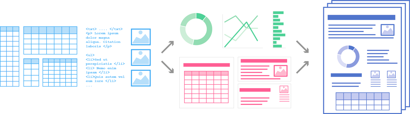
How Pagination Automates Chart Creation
Pagination uses Python to generate all standard financial chart types: line charts, bar charts, scatter plots, cumulative performance graphs, and more.
By pulling data directly from structured sources (like Excel or APIs), Pagination automatically generates financial charts and inserts them into high-quality PDF or InDesign documents. This allows you to produce investor-ready materials in minutes.
Case Example: Ninepoint Partners
Ninepoint used Pagination to automate the production of fund fact sheets, including time-sensitive line charts. The solution eliminated manual steps, reduced errors, and ensured that each chart reflected real-time performance metrics.
Conclusion: Build Better Reports with Financial Charts and Automation
Financial graphs are a powerful way to communicate data-driven insights. Choosing the right type of chart helps clarify your message, while automation makes the process faster and more reliable.
Whether you’re building an Excel forecast or producing hundreds of fund fact sheets, tools like Pagination can transform your workflow.
Ready to automate your financial reporting?
Discover more about Pagination database publishing or watch the demo to discover how our software can streamline your chart generation and report production.
FAQs
What is the best graph to show financial trends?
The line chart is the most common and effective for tracking performance over time.
Can I use Excel to create financial projection graphs?
Yes, Excel supports line, bar, and area charts that can visualize forecasts and projections.
What chart type shows return distribution best?
A box and whisker plot is best for showing the range, quartiles, and outliers in return data.
How can I automate the creation of financial charts?
You can use tools like Pagination that connect to your data source and generate charts programmatically using Python.
What is a financial graph maker?
It’s a tool or software that helps you create financial graphs—either manually (like Excel) or automatically (like Pagination).
