We have released a major update to the Pagination Web App. The goal is simple: speed up daily tasks, improve readability, and give you more control over projects, usage, and history, whether you are working from desktop or mobile. This update brings our catalog software to the next level.
Why This Update Matters
Users who rely on Pagination to generate catalogs, price lists, and product data sheets often work with complex projects, numerous images, and many layouts over time. The new interface was designed to:
- Make navigation more immediate, with more space dedicated to content
- Improve visibility on usage, storage, and layout history
- Support a consistent experience on smartphones and tablets, useful for quick checks outside the office
What’s New

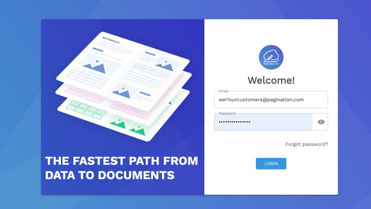
1. Redesigned Login Screen
The new login screen introduces a cleaner, more accessible design. The login area has been optimized for readability, and the layout adapts naturally to different screen sizes.
In practice: Clearer access, better rendering on small monitors and mobile devices.
2. Collapsible Sidebar Navigation
The horizontal navigation bar has been replaced by a collapsible side menu, designed to give more space to the work area and make it easier to switch between main sections.
- More space for content: Collapsing the menu expands the main area, making it easier to work on projects and results
- Quick access to key sections: Pagination, History, Asset Management, and the new Project Info page are always available
- Fewer distractions: Cleaner interface, better focus on operations
3. New Project Info Section
We have introduced a new page dedicated to project information, useful for checking usage, limits, and history in a centralized way.
| Feature | Description |
|---|---|
| Space Used | Visibility on total space (GB), number of uploaded assets, and plan limits |
| Layout Chart | Overview of layouts grouped by month to track trends over time |
| Layout Table | Detailed list with date, user, status, and ability to export data in Excel format |
| Direct Link to History | Open the corresponding layout from any row without manual searches |
In practice: More operational control and less time spent reconstructing what happened, when, and with what results.
4. Responsive Design for Mobile Devices
The entire interface is now fully responsive, with menus and layouts that automatically adapt to screen size.
- Quick status checks on layouts even when away from the office
- Review exports from your phone or tablet
- Consistent navigation between sections, following the same logic as desktop
Availability
The new interface will be progressively available to all users. For questions or feedback, you can contact our support team.
Ready to see the new interface in action? Log in to your account or request a demo to get started.