
Of course, when making a product catalog with T-shirts, you can randomly scatter the pics all over a page, digital or printed, without caring much about the layout and aesthetic appeal. But will it “click” with your target audience?
Unlikely.
We’ve got a better suggestion—create a stunning, aesthetically pleasing page (or pages) that will leave your customers speechless with only one thought, “Wow, I need this tee!”
Let’s design a T-shirt catalog that is as outstanding and stylish as your products. We’ve also packed a take-out toolbox to put your T-shirt catalogs on autopilot. Would you like to peek into it? Your curiosity called—it said: keep reading.
How to Create a T-Shirt Catalog Layout That Wows
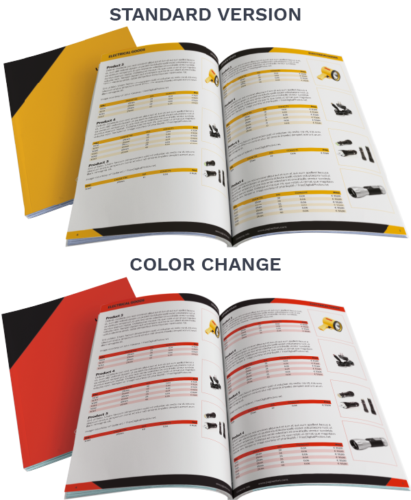
Brand Your Catalog First
Why should you bother about a branded T-shirt catalog?
The reason is straightforward: branding is the new black in marketing.
In the professional opinion of Brooke Webber, Head of Marketing at Ninja Patches, it is “nearly half of the path” to a successful catalog design. Webber shares, “The major goal of our promos and product catalogs is to highlight the customization options and speed—the ninja speed, to be exact—in delivery. We normally do that with our brand identifiers: logo (ninja), color (green), font (Suisse Intl), and several taglines. When building a product catalog, make sure it contains your unique attributes to emphasize your brand’s peculiarity and improve your visibility and recognition.”
That’s how you can “root” your brand identity in your customers’ minds and consistently remind them about your company from page to page in your T-shirt catalog.
For example:
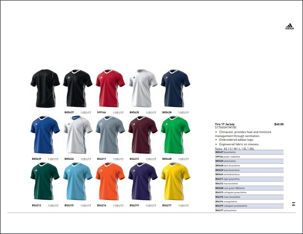
Look at Adidas’ clothing catalog, which features a collection of sports T-shirts. The tiny logo in the upper right corner becomes the ultimate trump card for the brand’s memorability.
Steal Attention with Complementary Colors
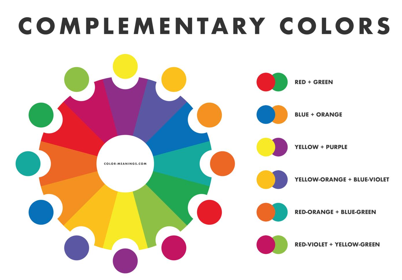
Jesse Hanson, Content Manager at Online Solitaire & World of Card Games, remarks, “If there is one thing that I have learned in my time in content creation, it is that our individual attention spans, on average, have started to shrink over time. Therefore, visual impact through colors is becoming more and more significant. You simply will have less time to grab and hold your audience’s attention, so you need a higher color contrast in your T-shirt catalog design. And that’s when you can turn to complementary colors.”
Despite the name, they are located on the opposite sides of the color psychology wheel and produce a striking optical effect, aesthetic balance, and emotional resonance in consumers’ brains.
The top three combinations are:
- Red + Green
- Orange + Blue
- Purple + Yellow
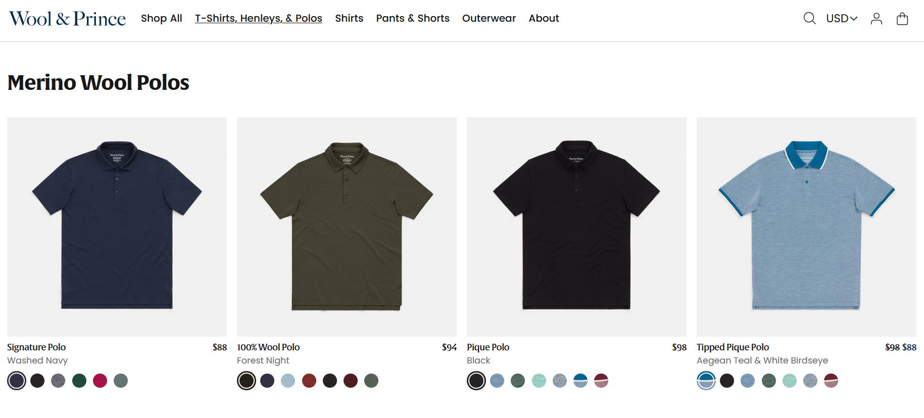
 For example, let’s compare two layouts at Wool & Prince.
Merino Wool Polos
Vs. Crew Neck Tees
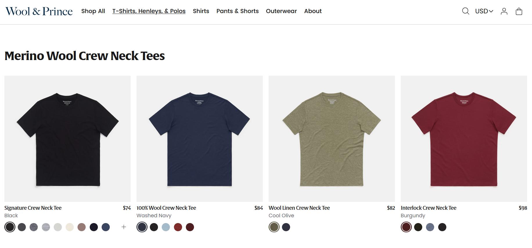
The first layout goes with non-contrasting colors: Washed Navy, Forest Night, Black, Aegean Teal + White Birdseye. The second layout creates greater contrast (Olive and Burgundy), even in pastel shades. That’s why it captures attention faster and holds it longer.
Break it Into Distinct Sections
Again, it all boils down to another psychological twist.
This time, however, it’s the psychology of order.
For one thing, the human brain prefers a structured arrangement of items and considers it more harmonious (and more beautiful!) than a disorganized sequence. For another, you can tap into customer segmentation (demographic, geographic, psychographic, etc.).
If you design printed T-shirt catalog layouts, add headings with sections and subsections. If you opt for digital ones, create a user-friendly navigation bar with clickable segments based on the following:
- Size
- Color
- Age-fit (for kids or adults)
- Style
- The occasion, etc.
For example:
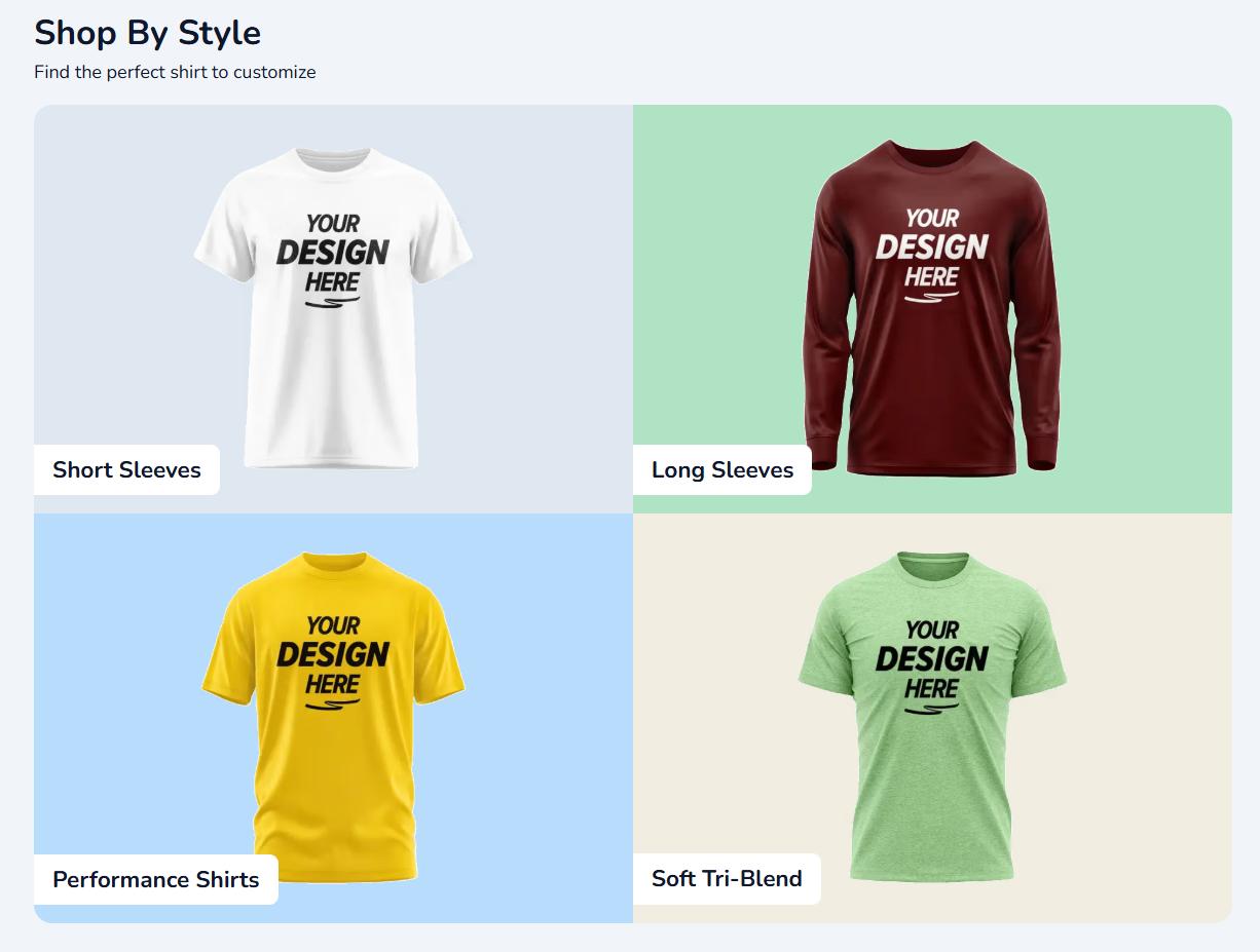
Suppose your company sells custom T-shirts with print-on designs. First, you should help your customers find the perfect tee to customize later. Navigate them by breaking your T-shirt catalog into sections: by gender (unisex, women’s, or men’s tees), by style (short/long-sleeve T-shirts, performance shirts, v-neck T-shirts), by brand (Hanes, Nike, Bella+Canvas), etc.
Put Visual Accents in T-Shirt Descriptions
Play with colors, font sizes, or symbols (don’t overindulge!) to visually highlight the essentials like these:
- Price
- Discount (if any)
- Size range
- Material and fabric details
- Availability (e.g., limited collection)
- Specific feature (the “top-seller” or the “green” badge)
For example:
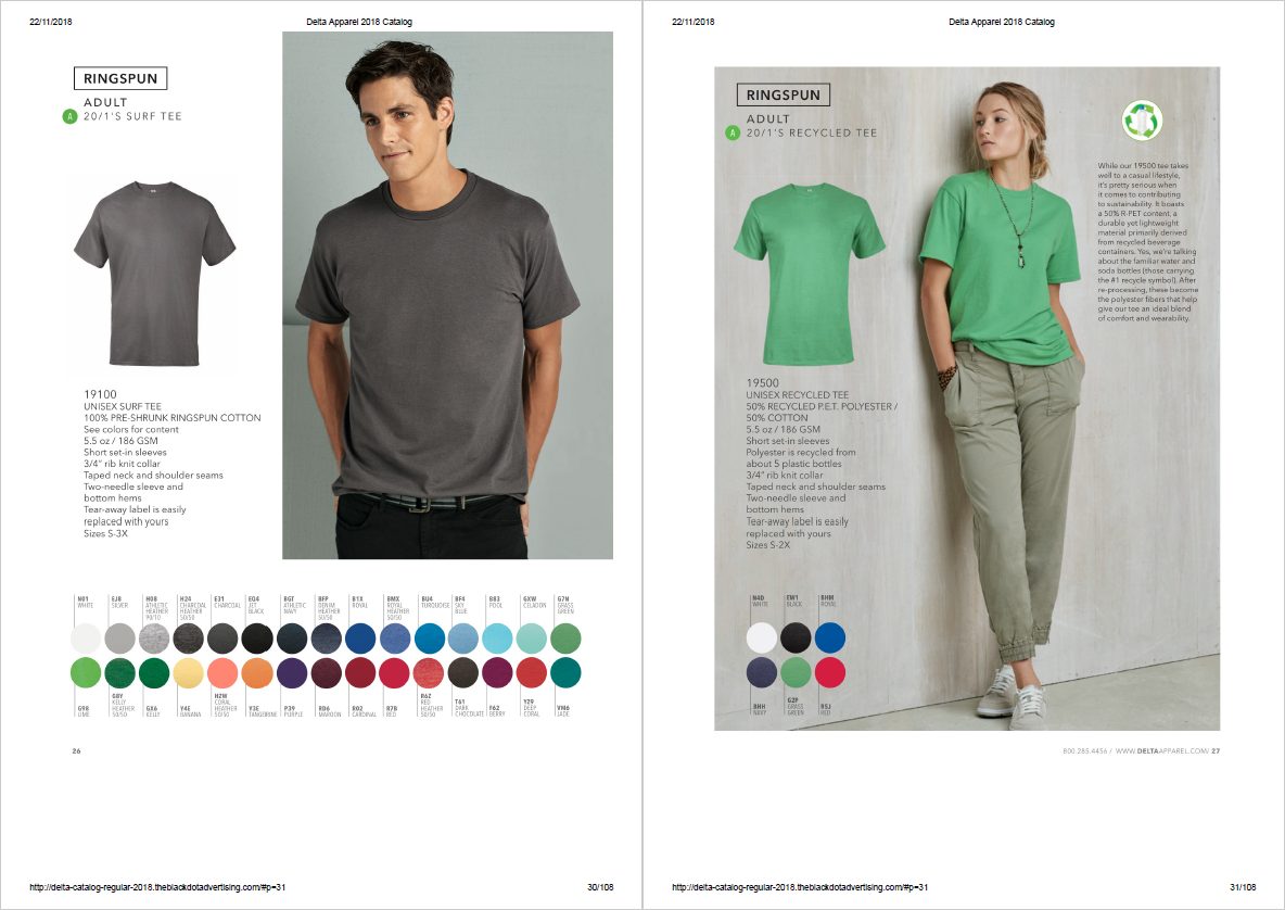
Delta Apparel added a recycling symbol to the T-shirt in one of its clothing product catalogs.
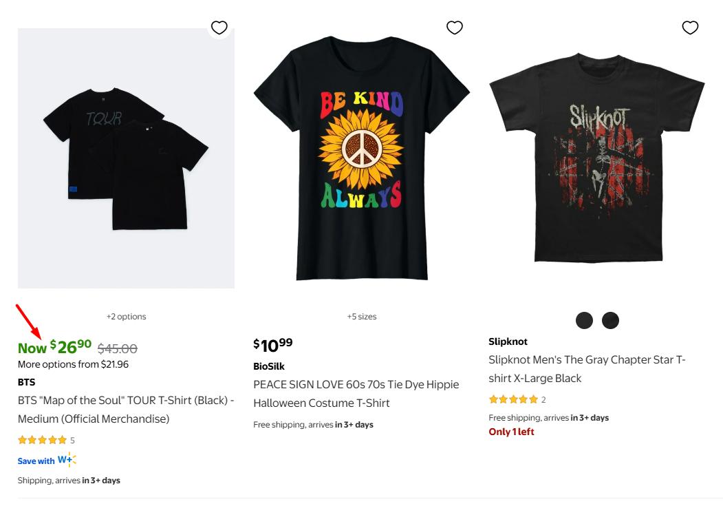
Alternatively, see how Walmart uses this design strategy for the T-shirt collection on the website. The brand highlights discounts in green for better visibility.
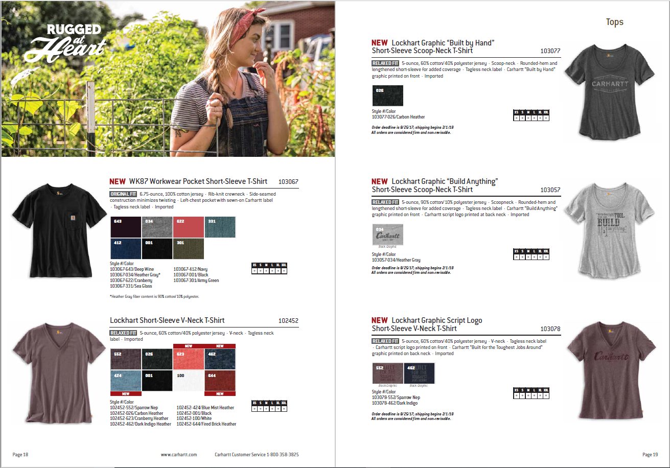
And if you look at Carhartt’s product catalog, you’ll see the word “NEW” in bold, red, and all caps near the newest T-shirts.
Besides, when you manage contracts with partners, you can also discuss the copyright aspects and place their logos and names in your T-shirt catalog. They may serve as solid social proof elements and add authority and credibility.
Rethink Your CTAs
A CTA (call-to-action) is something you’d better never overlook when creating a T-shirt catalog layout.
Here’s why.
It literally urges customers to take action after reviewing your tees. Embed a “Buy Now” or “Find Your Perfect Fit” CTA button into your digital catalog to redirect customers to the T-shirts in your eCommerce store. Then, you can also experiment with colors. Remember: The red CTA button converts 21% more effectively than the green one.
Are you developing a print version?
We’ve got an idea for it, too. How about adding scannable QR codes with CTAs, such as “Scan and Style Up!” or “Scan to Shop the Look,” to take your customers straight to online product pages?
This way, you’ll prepare your printed T-shirt catalog for m-commerce (mobile commerce) and create a positive customer experience for mobile users.

Best Tools for Designing T-Shirt Catalogs
Whether you’re struggling with T-shirt photos, descriptions, fonts, QR codes, or complex layouts, here’s a toolkit you need to get it all done:
- Photography editors: Adobe Photoshop, Affinity Photo, Remove.bg
- Product description generators: ShopiCraft, Writingmate.ai, Numerous.ai
- Font generators: FontGet, Lingojam, Fontello
- QR code makers: Qrscanner.net,QRTiger, Scanova.io, QRCode Monkey
- Product catalog creators: Pagination, Flipsnack, DCatalog
For example:
Pagination offers ready-made templates so that you can print or send your T-shirt catalog digitally in the snap of a finger. You can also upload your branded layouts and customize them on the fly whenever necessary.
Design Your T-Shirt Catalog with Pagination
Your product catalog should be more than just a scattered list of T-shirts. The stage is set for you to put your brand’s best foot forward and experiment with psychology-backed design principles to boost conversions (and naturally—sales!). Why not grab this chance right now with Pagination?
Happy designing and heavy revenues in your pockets!