Typography isn’t just about aesthetics: it’s the silent powerhouse behind effective print marketing materials. When you’re crafting a brochure, flyer or booklet, your font choices and formatting decisions directly influence how readers perceive your message, connect with your brand, and ultimately, whether they take action.
Imagine walking into a party where everyone is speaking at the exact same volume and tone. Boring, right? Typography in marketing is similar: when all your text looks identical, your message gets lost in the noise. But when you strategically vary your fonts, sizes, and formats, it’s like having a charismatic speaker who knows exactly when to whisper an intimate detail and when to project an important announcement across the room.
Let’s dive into the world of typography to help you create marketing materials that truly perform.
Table of Contents
- Why Typography Matters in Print Marketing
- Best Fonts for Brochures, Flyers, and Booklets
- What is the Best Font Size for a Brochure or Flyer?
- Typography Formatting Tips
- Top Fonts Recommended by Designers
- Tools and Resources for Choosing and Testing Fonts
Why Typography Matters in Print Marketing
First Impressions and Readability
Within seconds of looking at your marketing material, typography has already spoken volumes. A clean, legible typeface lets readers absorb your message effortlessly. In the limited real estate of brochures and flyers, the right font ensures your message lands instantly and clearly.
The Role of Typography in Brand Identity
Your chosen fonts are brand ambassadors on paper. A playful script might perfectly capture a children’s brand’s personality, while a sleek sans-serif reinforces a tech company’s modern image. Consider how a catalog font for a luxury fashion brand might lean toward sophisticated serif typefaces, whereas a price list font demands crystal-clear simplicity for quick reference.
How Typography Influences Conversion Rates
Research reveals that thoughtful typography can boost comprehension and information retention by up to 20%. This translates directly to higher engagement and response rates, especially crucial for advertising flyers and promotional materials where every interaction counts.
Best Fonts for Brochures, Flyers, and Booklets
Best Font for Brochures
Selecting the best font for brochures means finding the sweet spot between readability and character. Versatile options like Helvetica, Lato and PT Sans have gained popularity because they perform beautifully both in print and digital formats. For eye-catching brochure headlines, Montserrat or Raleway deliver that bold, contemporary impact you’re looking for. When designing a detailed product catalog, consider Roboto or Open Sans: they maintain excellent legibility even at smaller sizes. Find more ideas in brochure templates.

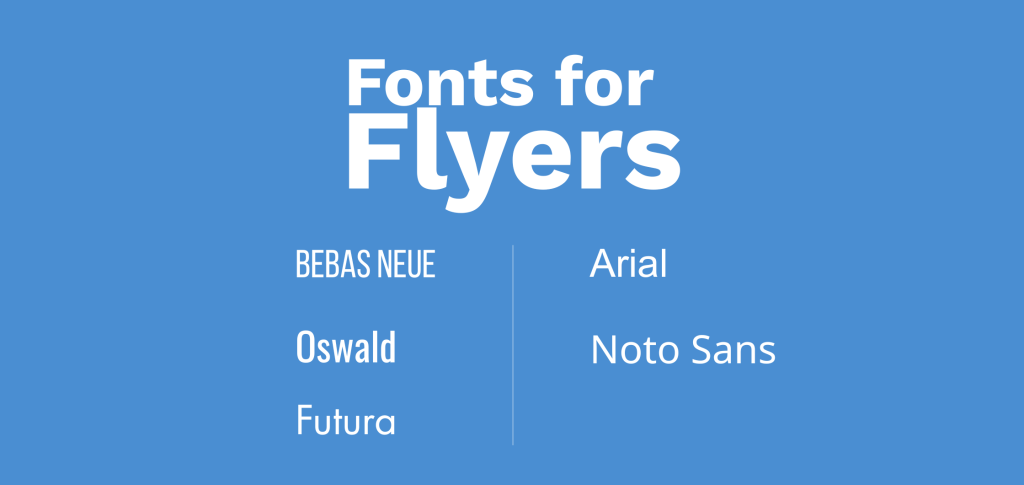
Best Font for Flyers
Flyers need to work hard and fast. Attention-grabbing typefaces such as Bebas Neue, Oswald, or Futura make perfect headlines that stop people in their tracks. For body text, keep it clean and simple, Arial or Noto Sans provide clarity without competing for attention. Find more ideas in flyer templates.
Fonts for Booklets
When designing longer documents such as booklets, readability and structure are crucial, especially for font booklet or a typeface booklet Serif fonts like Garamond, Merriweather and Georgia excel in printed booklets, reducing eye strain during extended reading while naturally guiding readers through structured content.
Booklets typically contain diverse sections, from introductions to product descriptions, tables, and legal information. Consistency becomes your best friend here. Develop a cohesive typographic system featuring:
- Bold, clear title styling for each section
- Distinctive treatment for captions and footnotes
- Consistent margins and baseline grids throughout
- Strategic font sizing—main body text (11–12 pt) versus supplementary content (9–10 pt)
Don’t underestimate the power of thoughtful layout: use headers and subheaders strategically to break up content blocks and guide the reader’s journey. For image-rich booklets, choose typefaces that complement without competing, such as Source Serif Pro or IBM Plex Serif.

What is the Best Font Size for a Brochure or Flyer?
Recommended Font Sizes by Element
- Title: 24–36 pt (commanding attention without overwhelming)
- Subheadings: 16–20 pt (creating clear content breaks)
- Body text: 10–12 pt (comfortable reading size)
- Call-to-action (CTA): 14–18 pt (prominent without shouting)
This sizing hierarchy creates visual order and guides readers naturally through your information. Always print test copies before finalizing, especially for compact formats like tri-fold brochures or double-sided flyers.
Font Size Based on Format and Medium
For print materials, resist the temptation to go below 10 pt for body text: your readers’ eyes will thank you. Digital brochures offer more flexibility since viewers can zoom. When working on a catalog or price list, maintaining consistent sizing across sections dramatically improves scannability and user experience.
Typography Formatting Tips
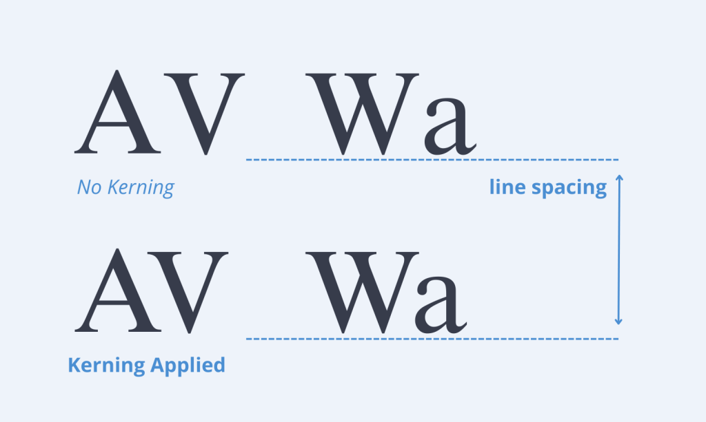
Line Spacing and Kerning
To make body text easy to read, set the line spacing (also called leading) to about 120–140% of the font size. Don’t forget kerning: adjusting the space between letters in headlines by hand can make your design look clean and professional.
Alignment and Hierarchy
Left-aligned text remains the readability champion. Create intuitive visual hierarchies by playing with font weights (regular, bold, light), sizes, and strategic spacing.

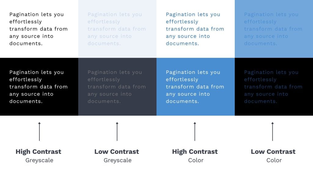
Color Contrast and Backgrounds
Always prioritize readability through strong contrast. Dark text on light backgrounds (or vice versa) ensures accessibility for all readers. When overlaying text on images, choose simpler background areas or add a subtle overlay to maintain legibility.
Avoiding Common Mistakes
- Limit yourself to 2–3 complementary fonts per design
- Save script fonts for headlines and accents, not body text
- Never distort fonts by stretching or squeezing them
Top Fonts Recommended by Designers
Professional designers consistently choose these fonts for catalogs, brochures, and advertising flyers:
- Helvetica: The versatile classic that works everywhere
- Futura: Perfect for bold, forward-looking flyers
- Garamond: The sophisticated choice for elegant booklets
- Lato: Approachable yet professional, highly readable
- Raleway: Creates standout headers with personality
- Playfair Display: Brings timeless sophistication to luxury materials
- Open Sans: Excels in dense layouts where legibility is non-negotiable
Tools and Resources for Choosing and Testing Fonts
- Google Fonts: Extensive library of free, open-source fonts
- Adobe Fonts: Premium typefaces seamlessly integrated with Creative Cloud
- Fontpair.co: Inspiration for perfect font combinations
- Canva / Figma / InDesign: Design platforms to test and refine your typographic choices
Frequently Asked Questions
What is the best font for a brochure?
Sans-serif fonts like Lato or Helvetica deliver outstanding readability and clean, professional design.
What is the best font size for a brochure?
The golden rule is 10–12 pt for body text, scaling up appropriately for headings and calls to action.
Which fonts look professional in a flyer?
Futura, Oswald, and Montserrat create impactful, contemporary flyers that command attention.
Can I use more than one font in a brochure?
Absolutely, but limit yourself to 2-3 complementary fonts to maintain visual harmony.
What fonts work well for long texts in booklets?
Serif fonts like Garamond or Georgia enhance readability and reduce eye fatigue in multi-page documents.
Ready to Build Professional Marketing Materials?
The right typography transforms an ordinary layout into a compelling, professional design. Whether you’re creating brochures, catalogs, flyers or price lists, thoughtful typeface choices will elevate your content and strengthen your brand identity.
Looking to streamline the creation of consistently beautiful marketing materials? Discover Pagination and revolutionize your document production workflow today.